KEYS R workshop

About
This is a short 1 hour and 45 minutes introduction to R and the tidyverse prepared and delivered by Kelsey Gonzalez for BIO5 Institute’s KEYS (Keep Engaging Youth in Science) Research Internship Program on June 10, 2020.
A PDF of this lesson is available here
This lesson is largely adapted from Software and Data Carpentry materials by Kelsey Gonzalez for use with the Penguins dataset.
Getting set up
R works by having a base programming language that can be added on to with community-created open-source extensions called packages. We’re going to first install two packages that we will work with today.
install.packages("tidyverse")
install.packages("palmerpenguins")
library(tidyverse)
library(palmerpenguins)What is an R package?
An R package is a complete unit for sharing code with others. Each R package contains the code for a set of R functions, the documentation (or description) for each of the functions, as well as a practice dataset to learn the functions on.
Generally, each R package is built with a specific task in mind. For instance, the package dplyr provides easy tools for the most common data manipulation tasks. It is built to work directly with data frames, with many common tasks optimized by being written in a compiled language (C++) (not all R packages are written in R!).
But there are also packages available for a wide range of tasks including building plots (ggplot2, which we’ll see later), downloading data from the NCBI database, or performing statistical analysis on your data set. Many packages such as these are housed on, and downloadable from, the Comprehensive R Archive Network (CRAN) using install.packages. This function makes the package accessible by your R installation with the command library(), as you did with tidyverse earlier.
To easily access the documentation for a package within R or RStudio, use help(package = "package_name").
Let’s first load the data we’ll be using today, which contains observations for 3 penguin species on islands in the Palmer Archipelago, Antarctica. More information about this dataset can be found at github.com/allisonhorst/penguins.
We only have a short lesson today, so I won’t get into the specifics on what we’re doing here. Just know we loaded a package called penguins above which contained a dataset called penguins. By calling data(), we’re asking r to load a dataset that is in the package. R also can read csv files, excel files, and many other data types.
data(penguins)Data Wrangling & visualization:
adapted from: https://datacarpentry.org/r-socialsci/03-dplyr-tidyr/index.html
questions:
- How can I select specific rows and/or columns from a data frame?
- How can I combine multiple commands into a single command?
- How can create new columns or remove existing columns from a data frame?
- How can I reformat a dataframe to meet my needs?
objectives:
- Describe the purpose of an R package and the
dplyrandtidyrpackages.
- Select certain columns in a data frame with the
dplyrfunctionselect.
- Select certain rows in a data frame according to filtering conditions with the
dplyrfunctionfilter.
- Link the output of one
dplyrfunction to the input of another function with the ‘pipe’ operator%>%.
- Add new columns to a data frame that are functions of existing columns with
mutate.
- Use the split-apply-combine concept for data analysis.
- Use
summarize,group_by, andcountto split a data frame into groups of observations, apply a summary statistics for each group, and then combine the results.
- Describe the concept of a wide and a long table format and for which purpose those formats are useful.
- Describe what key-value pairs are.
- Reshape a data frame from long to wide format and back with the
spreadandgathercommands from thetidyrpackage.
- Export a data frame to a csv file.
keypoints:
- Use the
dplyrpackage to manipulate dataframes.
- Use
select()to choose variables from a dataframe.
- Use
filter()to choose data based on values.
- Use
group_by()andsummarize()to work with subsets of data.
- Use
mutate()to create new variables.
- Use the
tidyrpackage to change the layout of dataframes.
Data Manipulation using dplyr
dplyr is a package for making tabular data manipulation easier by using a limited set of functions that can be combined to extract and summarize insights from your data.
Similarly to readr, dplyr and tidyr are also part of the tidyverse. These packages were loaded in R’s memory when we called library(tidyverse) earlier.
To learn more about dplyr after the workshop, you may want to check out this
handy data transformation with dplyr cheatsheet.
We’re going to learn some of the most common dplyr functions:
select(): subset columnsfilter(): subset rows on conditionsmutate(): create new columns by using information from other columnsgroup_by()andsummarize(): create summary statistics on grouped dataarrange(): sort results
Explore our data
Let’s explore our data first. There’s 7 variables or columns that we have to work with.
species: penguin species (Chinstrap, Adélie, or Gentoo)bill_length_mm: bill length (mm)bill_depth_mm: bill depth (mm)flipper_length_mm: flipper length (mm)body_mass_g: body mass (g)island: island name (Dream, Torgersen, or Biscoe) in the Palmer Archipelago (Antarctica)sex: penguin sex
Here’s what the three penguins species look like in real life:

We have a few options to preview our dataframe. My favorite is glimpse()
glimpse(penguins)You can also View() the data, which opens the data in a R Studio viewer pane. Note the capital V.
View(penguins)Selecting columns and filtering rows
To select columns of a data frame, use select(). The first argument to this function is the data frame (penguins), and the subsequent arguments are the columns to keep.
select(penguins, species, body_mass_g, sex)To choose rows based on a specific criteria, use filter():
filter(penguins, island == "Biscoe")The filter function works with most boolean operators, namely:
| Operator | Description |
|---|---|
< |
less than |
<= |
less than or equal to |
> |
greater than |
>= |
greater than or equal to |
== |
exactly equal to |
!= |
not equal to |
!x |
Not x |
x | y |
x OR y |
x & y |
x AND y |
isTRUE(x) |
test if X is TRUE |
Pipes
What if you want to select and filter at the same time? There are three ways to do this: use intermediate steps, nested functions, or pipes.
With intermediate steps, you create a temporary data frame and use that as input to the next function, like this:
penguins_biscoe <- filter(penguins, island == "Biscoe")
penguins_biscoe <- select(penguins_biscoe, species, body_mass_g, sex)
This is readable, but can clutter up your workspace with lots of objects that you have to name individually. With multiple steps, that can be hard to keep track of.
You can also nest functions (i.e. one function inside of another), like this:
penguins_Biscoe <- select(filter(penguins, island == "Biscoe"), species, body_mass_g, sex)This is handy, but can be difficult to read if too many functions are nested, as R evaluates the expression from the inside out (in this case, filtering, then selecting).
The last option, pipes, are a powerful addition to R. Pipes let you take the output of one function and send it directly to the next, which is useful when you need to do many things to the same dataset. Pipes in R look like %>% and are made available via the magrittr package, installed automatically with dplyr. If you use RStudio, you can type the pipe with Ctrl + Shift + M if you have a PC or Cmd + Shift + M if you have a Mac.
penguins %>%
    filter(island == "Biscoe") %>%
    select(species, body_mass_g, sex)
## # A tibble: 168 x 3
## species body_mass_g sex
## <fct> <int> <fct>
## 1 Adelie 3400 female
## 2 Adelie 3600 male
## 3 Adelie 3800 female
## 4 Adelie 3950 male
## 5 Adelie 3800 male
## 6 Adelie 3800 female
## 7 Adelie 3550 male
## 8 Adelie 3200 female
## 9 Adelie 3150 female
## 10 Adelie 3950 male
## # … with 158 more rowsIn the above code, we use the pipe to send the penguins dataset first through filter() to keep rows where island is “Biscoe”, then through select() to keep only the species, body_mass_g,and sex columns. Since %>% takes the object on its left and passes it as the first argument to the function on its right, we don’t need to explicitly include the data frame as an argument to the filter() and select() functions any more.
Some may find it helpful to read the pipe like the word “then”. For instance, in the above example, we take the data frame penguins, then we filter for rows with island == "Biscoe", then we select columns species, body_mass_g,and sex. The dplyr functions by themselves are somewhat simple, but by combining them into linear workflows with the pipe, we can accomplish more complex manipulations of data frames.
If we want to create a new object with this smaller version of the data, we can assign it a new name:
penguins_biscoe <- penguins %>%
    filter(island == "Biscoe") %>%
    select(species, body_mass_g, sex)

penguins_biscoe
## # A tibble: 168 x 3
## species body_mass_g sex
## <fct> <int> <fct>
## 1 Adelie 3400 female
## 2 Adelie 3600 male
## 3 Adelie 3800 female
## 4 Adelie 3950 male
## 5 Adelie 3800 male
## 6 Adelie 3800 female
## 7 Adelie 3550 male
## 8 Adelie 3200 female
## 9 Adelie 3150 female
## 10 Adelie 3950 male
## # … with 158 more rowsNote that the final data frame (penguins_biscoe) is the leftmost part of this expression becuase it is receiving an assignment.
Exercise
Using pipes, subset the
penguinsdata to include all species EXCEPT Adelie and retain the species column in addition to those relating to their bill. ## Solution
penguins %>%
    filter(species != "Adelie") %>%
    select(bill_length_mm, bill_depth_mm)
Mutate
Frequently you’ll want to create new columns based on the values in existing columns, for example to do unit conversions, or to find the ratio of values in two columns. For this we’ll use mutate().
We might be interested in the flipper length of penguins in cm instead of milimeters:
penguins %>%
    mutate(flipper_length_cm = flipper_length_mm / 10)
## # A tibble: 344 x 9
## species island bill_length_mm bill_depth_mm flipper_length_… body_mass_g
## <fct> <fct> <dbl> <dbl> <int> <int>
## 1 Adelie Torge… 39.1 18.7 181 3750
## 2 Adelie Torge… 39.5 17.4 186 3800
## 3 Adelie Torge… 40.3 18 195 3250
## 4 Adelie Torge… NA NA NA NA
## 5 Adelie Torge… 36.7 19.3 193 3450
## 6 Adelie Torge… 39.3 20.6 190 3650
## 7 Adelie Torge… 38.9 17.8 181 3625
## 8 Adelie Torge… 39.2 19.6 195 4675
## 9 Adelie Torge… 34.1 18.1 193 3475
## 10 Adelie Torge… 42 20.2 190 4250
## # … with 334 more rows, and 3 more variables: sex <fct>, year <int>,
## # flipper_length_cm <dbl>We may be interested in investigating whether being a member of an irrigation association had any effect on the ratio of household members to rooms. To look at this relationship, we will first remove data from our dataset where the respondent didn’t answer the question of whether they were a member of an irrigation association. These cases are recorded as “NULL” in the dataset.
Exercise
Create a new data frame from the
penguinsdata that meets the following criteria: contains only thespeciescolumn and a new column calledbody_mass_kgcontaining a transformed body_mass_g. Only the rows wherebody_mass_kgis greater than 4 should be shown in the final data frame. How many rows do you have?Hint: think about how the commands should be ordered to produce this data frame!
Solution
penguins_large <- penguins %>%
    mutate(body_mass_kg = body_mass_g / 1000) %>%
    filter(body_mass_kg > 4) %>%
    select(species, body_mass_kg)
Split-apply-combine data analysis and the summarize() function
Many data analysis tasks can be approached using the split-apply-combine paradigm: split the data into groups, apply some analysis to each group, and then combine the results. dplyr makes this very easy through the use of the group_by() function.
The summarize() function
group_by() is often used together with summarize(), which collapses each group into a single-row summary of that group. group_by() takes as arguments the column names that contain the categorical variables for which you want to calculate the summary statistics. So to compute the average household size by island:
penguins %>%
    group_by(island) %>%
    summarize(mean_flipper_length_mm = mean(flipper_length_mm))
## # A tibble: 3 x 2
## island mean_flipper_length_mm
## <fct> <dbl>
## 1 Biscoe NA
## 2 Dream 193.
## 3 Torgersen NAYou may also have noticed that the output has a lot of NA! When R does calculations with missing data, it (correctly) doesn’t know how to evaluate them and forces the result to NA. to solve this, we need to add in a special option to tell R that we want to ignore the missing values.
Use the ? function on mean() to figure out what this option is.
penguins %>%
    group_by(island) %>%
    summarize(mean_flipper_length_mm = mean(flipper_length_mm, na.rm = TRUE))
## # A tibble: 3 x 2
## island mean_flipper_length_mm
## <fct> <dbl>
## 1 Biscoe 210.
## 2 Dream 193.
## 3 Torgersen 191.You can also group by multiple columns:
penguins %>%
    group_by(island, species) %>%
    summarize(mean_flipper_length_mm = mean(flipper_length_mm, na.rm = TRUE))
## # A tibble: 5 x 3
## # Groups: island [3]
## island species mean_flipper_length_mm
## <fct> <fct> <dbl>
## 1 Biscoe Adelie 189.
## 2 Biscoe Gentoo 217.
## 3 Dream Adelie 190.
## 4 Dream Chinstrap 196.
## 5 Torgersen Adelie 191.I expected to get 9 rows because we have 3 islands and 3 species of penguin. What do you think is going on here?
Once the data are grouped, you can also summarize multiple variables at the same time (and not necessarily on the same variable). For instance, we could add a column indicating the minimum and maximum flipper length for each island for each species:
penguins %>%
    group_by(island, species) %>%
    summarize(mean_flipper_length_mm = mean(flipper_length_mm, na.rm = TRUE),
              min_flipper_length_mm = min(flipper_length_mm, na.rm = TRUE),
              max_flipper_length_mm = max(flipper_length_mm, na.rm = TRUE))
## # A tibble: 5 x 5
## # Groups: island [3]
## island species mean_flipper_lengt… min_flipper_length… max_flipper_length…
## <fct> <fct> <dbl> <int> <int>
## 1 Biscoe Adelie 189. 172 203
## 2 Biscoe Gentoo 217. 203 231
## 3 Dream Adelie 190. 178 208
## 4 Dream Chinstrap 196. 178 212
## 5 Torgers… Adelie 191. 176 210It is sometimes useful to rearrange the result of a query to inspect the values. For instance, we can sort on mean_flipper_length_mm to put the group with the shortest flippers first:
penguins %>%
    group_by(island, species) %>%
    summarize(mean_flipper_length_mm = mean(flipper_length_mm, na.rm = TRUE),
              min_flipper_length_mm = min(flipper_length_mm, na.rm = TRUE),
              max_flipper_length_mm = max(flipper_length_mm, na.rm = TRUE)) %>%
    arrange(mean_flipper_length_mm)
## # A tibble: 5 x 5
## # Groups: island [3]
## island species mean_flipper_lengt… min_flipper_length… max_flipper_length…
## <fct> <fct> <dbl> <int> <int>
## 1 Biscoe Adelie 189. 172 203
## 2 Dream Adelie 190. 178 208
## 3 Torgers… Adelie 191. 176 210
## 4 Dream Chinstrap 196. 178 212
## 5 Biscoe Gentoo 217. 203 231To sort in descending order, we need to add the desc() function.
penguins %>%
    group_by(island, species) %>%
    summarize(mean_flipper_length_mm = mean(flipper_length_mm, na.rm = TRUE),
              min_flipper_length_mm = min(flipper_length_mm, na.rm = TRUE),
              max_flipper_length_mm = max(flipper_length_mm, na.rm = TRUE)) %>%
    arrange(desc(mean_flipper_length_mm))
## # A tibble: 5 x 5
## # Groups: island [3]
## island species mean_flipper_lengt… min_flipper_length… max_flipper_length…
## <fct> <fct> <dbl> <int> <int>
## 1 Biscoe Gentoo 217. 203 231
## 2 Dream Chinstrap 196. 178 212
## 3 Torgers… Adelie 191. 176 210
## 4 Dream Adelie 190. 178 208
## 5 Biscoe Adelie 189. 172 203Exercise:
Use
group_by()andsummarize()to find the mean bill_length and bill_depth each species.Solution
penguins %>%
  group_by(species) %>%
  summarize(
      mean_bill_length = mean(bill_length_mm, na.rm = TRUE),
      mean_bill_depth = mean(bill_depth_mm, na.rm = TRUE)
  )
Data Visualization
adapted from: https://datacarpentry.org/r-socialsci/04-ggplot2/index.html
questions:
- What are the components of a ggplot?
- How do I create scatterplots, boxplots, and barplots?
- How can I change the aesthetics (ex. colour, transparency) of my plot?
- How can I create multiple plots at once?
objectives:
- Produce scatter plots, boxplots, and time series plots using ggplot.
- Set universal plot settings.
- Describe what faceting is and apply faceting in ggplot.
- Modify the aesthetics of an existing ggplot plot (including axis labels and color).
- Build complex and customized plots from data in a data frame.
keypoints:
ggplot2is a flexible and useful tool for creating plots in R.
- The data set and coordinate system can be defined using the
ggplotfunction.
- Additional layers, including geoms, are added using the
+operator.
- Boxplots are useful for visualizing the distribution of a continuous variable.
- Barplot are useful for visualizing categorical data.
- Faceting allows you to generate multiple plots based on a categorical variable.
Plotting with ggplot2
ggplot2 is a plotting package that makes it simple to create complex plots from data stored in a data frame. It provides a programmatic interface for specifying what variables to plot, how they are displayed, and general visual properties. Therefore, we only need minimal changes if the underlying data change or if we decide to change from a bar plot to a scatterplot. This helps in creating publication quality plots with minimal amounts of adjustments and tweaking.
ggplot graphics are built step by step by adding new elements. Adding layers in this fashion allows for extensive flexibility and customization of plots.
To learn more about ggplot2 after the workshop, you may want to check out this
handy data transformation with ggplot2 cheatsheet.
To build a ggplot, we will use the following basic template that can be used for different types of plots:
ggplot(data = <DATA>, mapping = aes(<MAPPINGS>)) + <GEOM_FUNCTION>()- use the
ggplot()function and bind the plot to a specific data frame using thedataargument
ggplot(data = penguins)- define a mapping (using the aesthetic (
aes) function), by selecting the variables to be plotted and specifying how to present them in the graph, e.g. as x/y positions or characteristics such as size, shape, color, etc.
ggplot(data = penguins, aes(x = flipper_length_mm, y = body_mass_g)add ‘geoms’ – graphical representations of the data in the plot (points, lines, bars).
ggplot2offers many different geoms; we will use some common ones today, including:geom_point()for scatter plots, dot plots, etc.geom_boxplot()for, well, boxplots!geom_line()for trend lines, time series, etc.
To add a geom to the plot use the + operator. Because we have two continuous variables, let’s use geom_point() first:
ggplot(data = penguins, aes(x = flipper_length_mm, y = body_mass_g)) +
    geom_point()
The + in the ggplot2 package is particularly useful because it allows you to modify existing ggplot objects. This means you can easily set up plot templates and conveniently explore different types of plots, so the above plot can also be generated with code like this:
# Assign plot to a variable
penguins_plot <- ggplot(data = penguins, aes(x = flipper_length_mm, y = body_mass_g))

# Draw the plot
penguins_plot +
    geom_point()
Notes
- Anything you put in the
ggplot()function can be seen by any geom layers that you add (i.e., these are universal plot settings). This includes the x- and y-axis mapping you set up inaes().- You can also specify mappings for a given geom independently of the mapping defined globally in the
ggplot()function.- The
+sign used to add new layers must be placed at the end of the line containing the previous layer. If, instead, the+sign is added at the beginning of the line containing the new layer,ggplot2will not add the new layer and will return an error message.
## This is the correct syntax for adding layers
penguins_plot +
    geom_point()

## This will not add the new layer and will return an error message
penguins_plot
+ geom_point()
Building your plots iteratively
Building plots with ggplot2 is typically an iterative process. We start by defining the dataset we’ll use, lay out the axes, and choose a geom:
ggplot(data = penguins, aes(x = flipper_length_mm, y = body_mass_g)) +
    geom_point()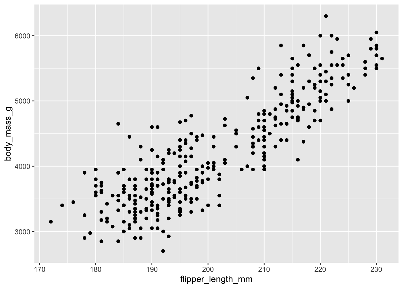
Then, we start modifying this plot to extract more information from it. For instance, we can add transparency (alpha) to avoid overplotting:
ggplot(data = penguins, aes(x = flipper_length_mm, y = body_mass_g)) +
geom_point(alpha = 0.5)![]()
That only helped a little bit with the overplotting problem. We can also introduce a little bit of randomness into the position of our points using the geom_jitter() function.
ggplot(data = penguins, aes(x = flipper_length_mm, y = body_mass_g)) +
    geom_jitter(alpha = 0.5)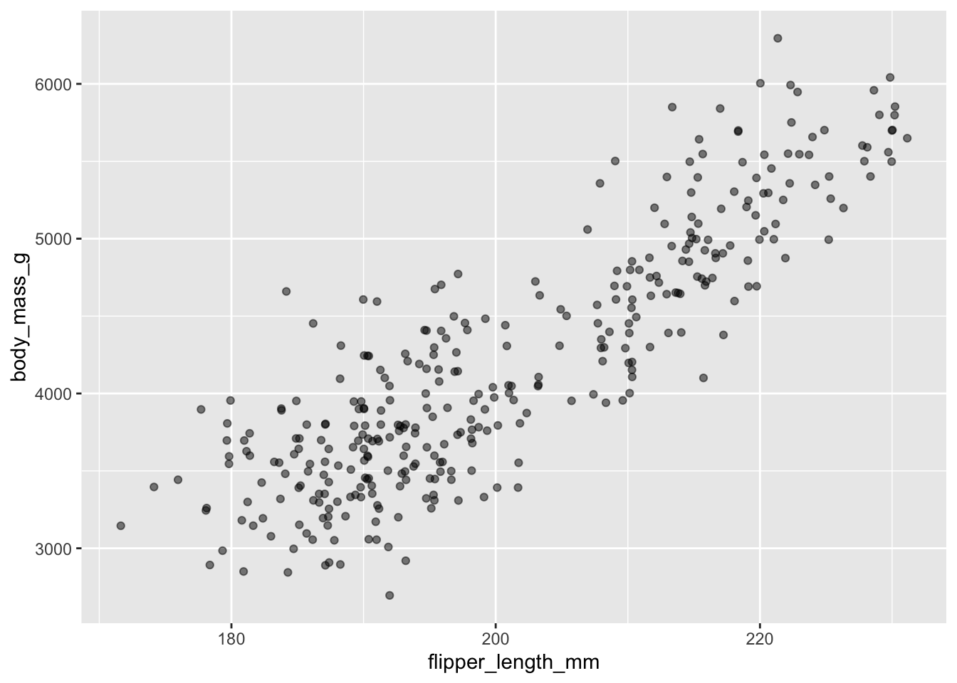
We can also add colors for all the points:
ggplot(data = penguins, aes(x = flipper_length_mm, y = body_mass_g)) +
    geom_jitter(alpha = 0.5, color = "blue")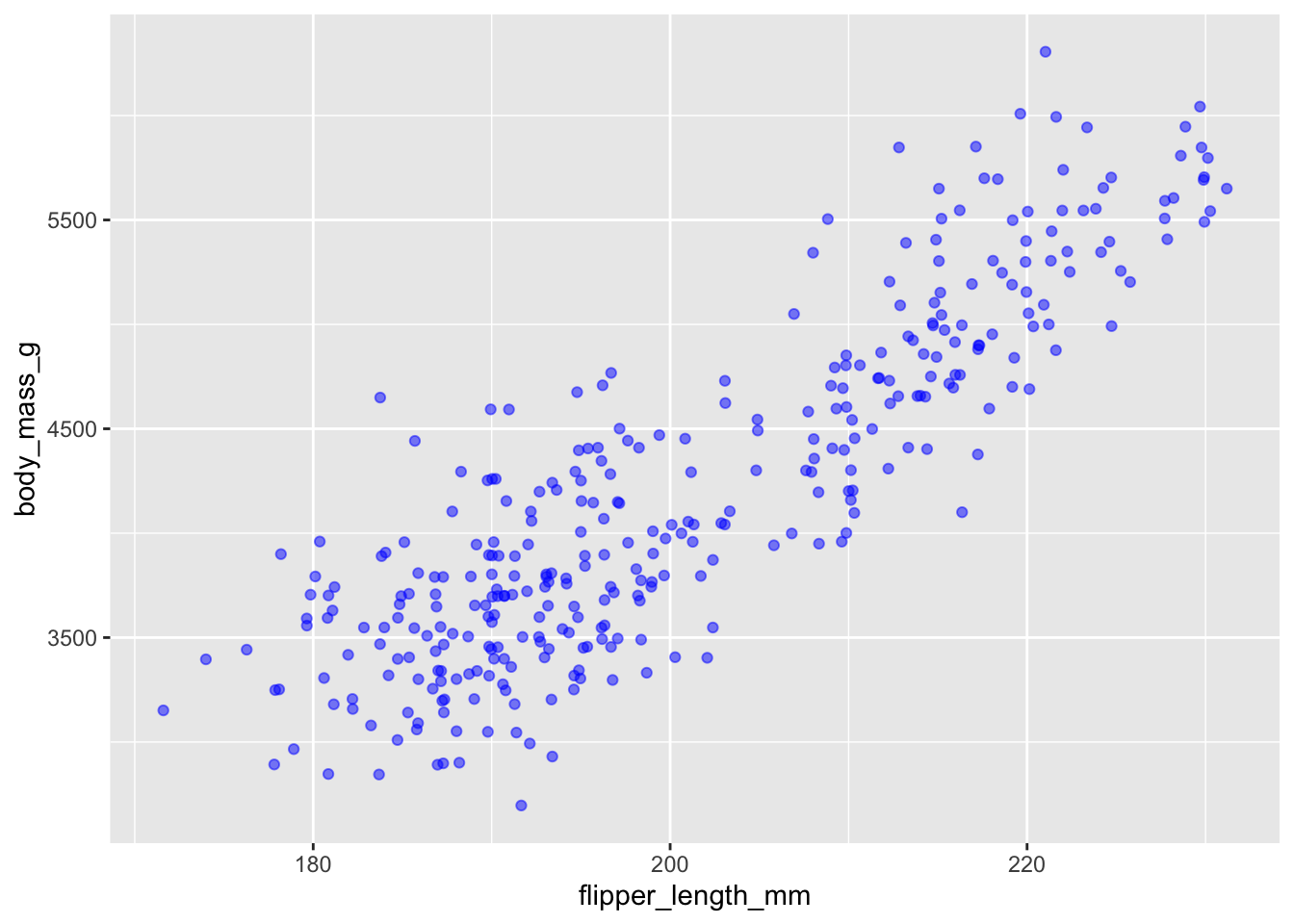
Or to color each species in the plot differently, you could use a vector as an input to the argument color. Because we are now mapping features of the data to a color, instead of setting one color for all points, the color now needs to be set inside a call to the aes function. ggplot2 will provide a different color corresponding to different values in the vector. We set the value of alpha outside of the aes function call because we are using the same value for all points. Here is an example where we color by island:
ggplot(data = penguins, aes(x = flipper_length_mm, y = body_mass_g)) +
    geom_jitter(aes(color = species), alpha = 0.5)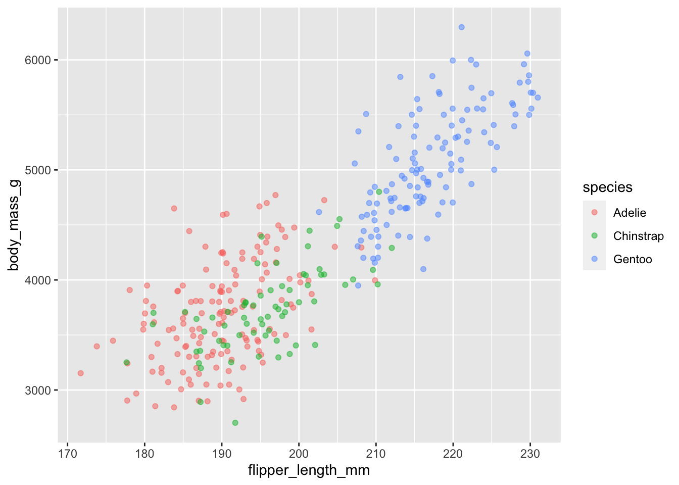
There appears to be a positive trend between flipper length and body massof penguins. This trend does not appear to be different by species, but we can see that Chinstrap and Adelie penguins have shorter flippers and small body mass than Gentoo.
Adding Labels and Titles
By default, the axes labels on a plot are determined by the name of the variable being plotted. However, ggplot2 offers lots of customization options, like specifying the axes labels, and adding a title to the plot with relatively few lines of code. We will add more informative x and y axis labels to our plot of proportion of house type by island and also add a title.
ggplot(data = penguins, aes(x = flipper_length_mm, y = body_mass_g)) +
    geom_jitter(aes(color = species), alpha = 0.5) +
    labs(title="Body Mass by Flipper Length",
         x="Flipper Length (mm)",
         y="Body Mass (g)")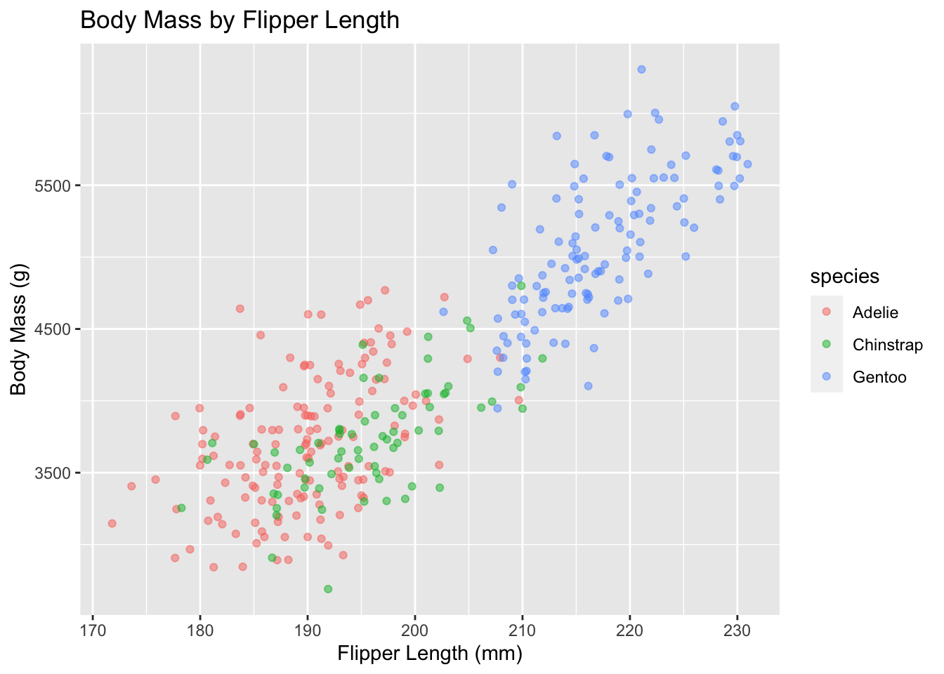
Exercise
Use what you just learned to create a scatter plot of
bill_length_mmbyspecieswith thesexshowing in different colors. Is this a good way to show this type of data?Solution
ggplot(data = penguins, aes(x = species, y = bill_length_mm)) +
geom_jitter(aes(color = sex))
This is not a good way to show this type of data because it is difficult to distinguish between islands.
Boxplot
We can use boxplots to visualize the distribution of rooms for each wall type:
ggplot(data = penguins, aes(x = species, y = bill_length_mm)) +
    geom_boxplot()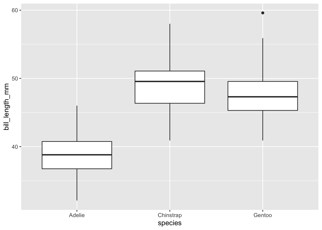
By adding points to a boxplot, we can have a better idea of the number of measurements and of their distribution:
ggplot(data = penguins, aes(x = species, y = bill_length_mm)) +
    geom_boxplot(alpha = 0) +
    geom_jitter(alpha = 0.5, color = "tomato")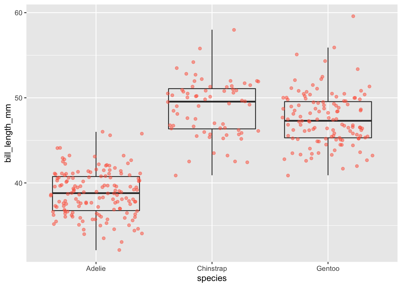
We can see that Adelie penguins tend to have shorter bills than other species.
Notice how the boxplot layer is behind the jitter layer? What do you need to change in the code to put the boxplot in front of the points such that it’s not covered?
Exercise
Boxplots are useful summaries, but hide the shape of the distribution. For example, if the distribution is bimodal, we would not see it in a boxplot. An alternative to the boxplot is the violin plot, where the shape (of the density of points) is drawn.
- Replace the box plot with a violin plot; see
geom_violin().Solution
ggplot(data = penguins, aes(x = species, y = bill_length_mm)) +
  geom_violin(alpha = 0) +
  geom_jitter(alpha = 0.5, color = "tomato")
Barplots
Barplots are also useful for visualizing categorical data. By default, geom_bar accepts a variable for x, and plots the number of instances each value of x (in this case, wall type) appears in the dataset.
ggplot(data = penguins, aes(x = island)) +
    geom_bar()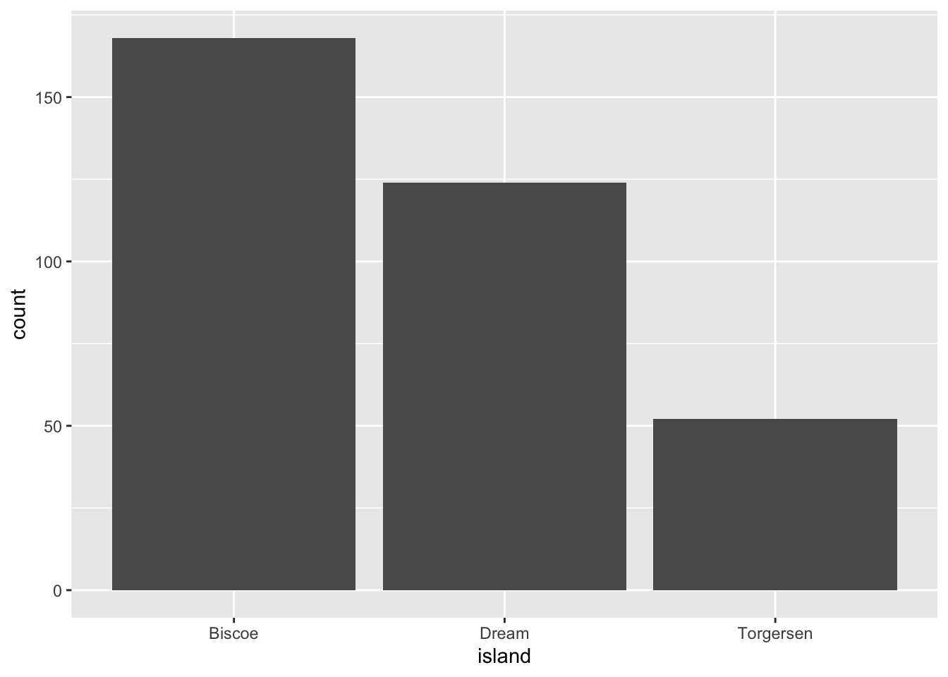
We can use the fill aesthetic for the geom_bar() geom to color bars by the portion of each count that is from each island.
ggplot(data = penguins, aes(x = island)) +
    geom_bar(aes(fill = species))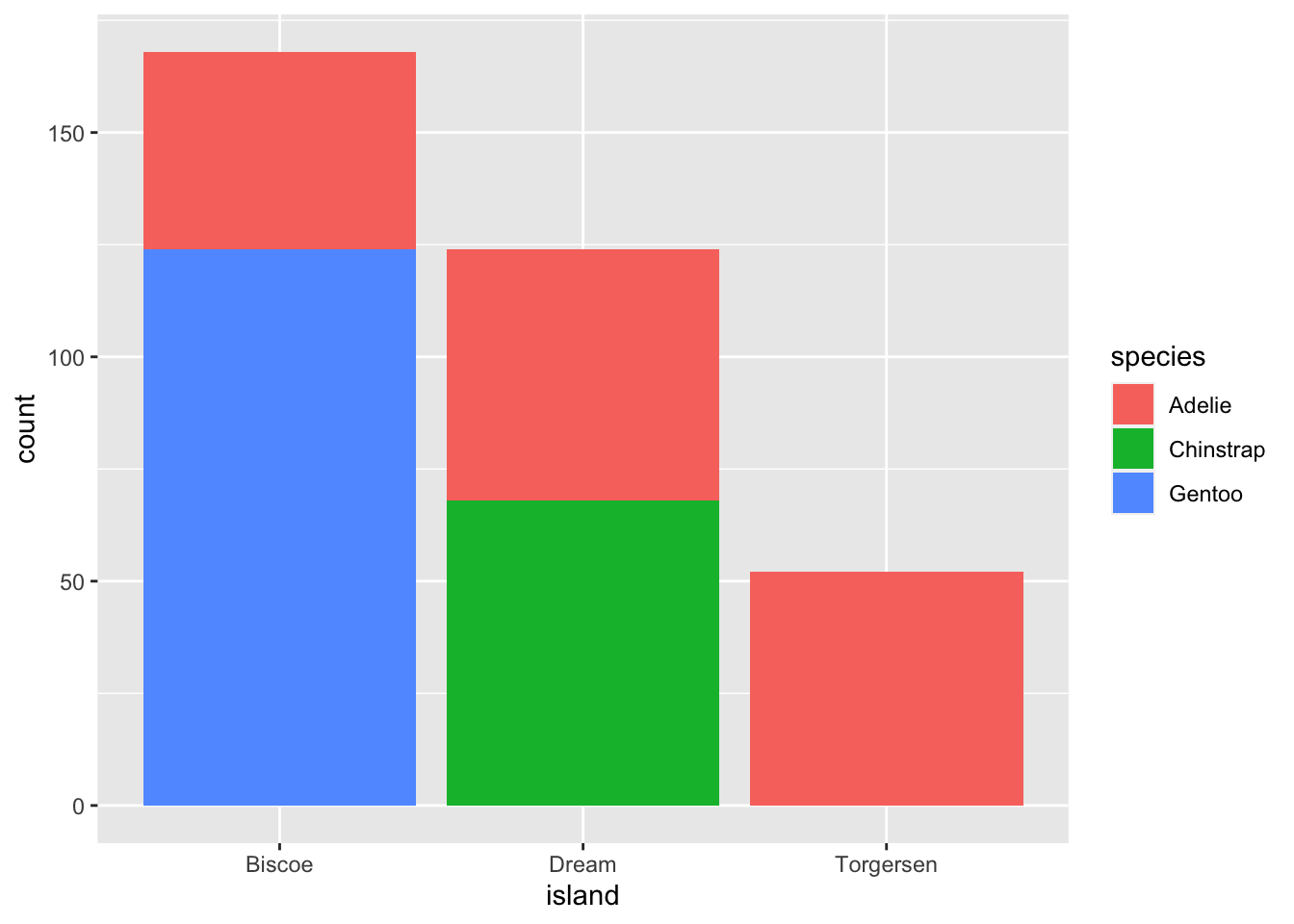
This creates a stacked bar chart. These are generally more difficult to read than side-by-side bars. We can separate the portions of the stacked bar that correspond to each island and put them side-by-side by using the position argument for geom_bar() and setting it to “dodge”.
ggplot(data = penguins, aes(x = island)) +
    geom_bar(aes(fill = species), position = "dodge")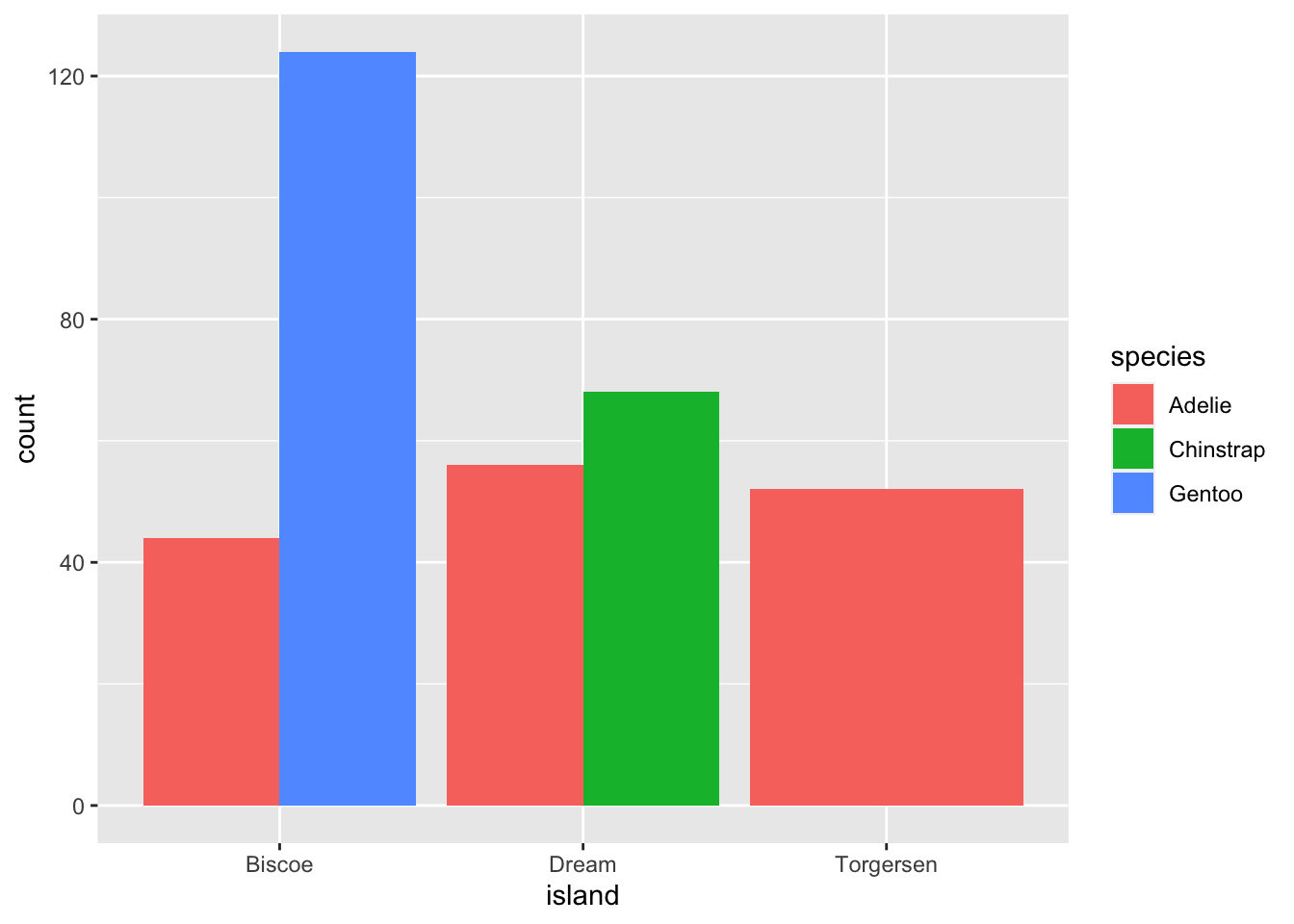
ggplot2 themes
In addition to theme_bw(), which changes the plot background to white, ggplot2 comes with several other themes which can be useful to quickly change the look of your visualization. The complete list of themes is available at http://docs.ggplot2.org/current/ggtheme.html. theme_minimal() and theme_light() are popular, and theme_void() can be useful as a starting point to create a new hand-crafted theme.
The ggthemes package provides a wide variety of options (including an Excel 2003 theme). The ggplot2 extensions website provides a list of packages that extend the capabilities of ggplot2, including additional themes.
Customization
Take a look at the ggplot2 cheat
sheet, and think of ways you could improve the plot.
Exercise
With all of this information in hand, please take another five minutes to either improve one of the plots generated in this exercise or create a beautiful graph of your own.
- See if you can make the bars white with black outline.
- Try using a different color palette (see http://www.cookbook-r.com/Graphs/Colors_(ggplot2)/).
Kelsey E. Gonzalez, PhD
Associate Principal Data Scientist
Data Scientist; Computational Social Scientist.