gganimate: A Lesson with Avocados

Animating your ggplots may sound daunting. However, you have to add a line or two extra of code and you have an animation! gganimate makes animation quite accessible for users of ggplot.
A cheat sheet for what we’ll cover today:
- Types of Transitions
- transition_reveal() (good for mainly geom_line)
- transition_states() (good for geom_point, geom_bar, geom_col, etc)
- splits up plot data by a discrete variable and animates between the different states.
- transition_time() (geom_point)
- Instead of transitioning over a discrete variable, the transition occurs over a continuous variable (Time)
- Instead of transitioning over a discrete variable, the transition occurs over a continuous variable (Time)
- Some extras
- shadow_mark()
- This shadow lets you show the raw data behind the current frame. Both past and/or future raw data can be shown and styled as you want.
- This shadow lets you show the raw data behind the current frame. Both past and/or future raw data can be shown and styled as you want.
- shadow_wake()
- instead of leaving a more permanent mark, wake leaves a tail to show direction, but only reveals the past few states
- instead of leaving a more permanent mark, wake leaves a tail to show direction, but only reveals the past few states
- view_follow(fixed_y = TRUE)
- controls how your viewport changes as the transition occurs
- controls how your viewport changes as the transition occurs
anim_save()- It works much like
ggsave()from ggplot2 and automatically grabs the last rendered animation if you do not specify one directly.
- It works much like
- shadow_mark()
Let’s load back up our data from the previous lessons on R by Adriana Picoral (picoral.github.io/resbaz_intro_to_r/parti.html) and from Kathryn Busby on ggplot2. I’ll name the dataframe avocado because I can’t remember what the other instructors named their data. We will also load our packages here.
library(tidyverse)
# install.packages("gganimate")
library(gganimate)
# install.packages("scales")
library(scales)
avocado <- read_csv("avocado.csv")
Avocado data is originally from www.kaggle.com/neuromusic/avocado-prices/data.
Let’s explore our data a little bit..
glimpse(avocado)
summary(avocado)
class(avocado$Date) #make sure `Date` is actually a date type
unique(avocado$region)# what type of regions are included here?
You’ll notice that our region variable is kind of all over the place. Because I’ve reviewed this before, I know we need to separate out the US level, states, regions, and cities so our graphs are on the same level.
avocado_us <- avocado %>% filter(region == "TotalUS")
states <- c("California")
avocado_CA <- avocado %>% filter(region %in% states)
regions <- c("West","Southeast","SouthCentral","Plains","Northeast","Midsouth","GreatLakes","WestTexNewMexico","NorthernNewEngland")
avocado_region <- avocado %>% filter(region %in% regions)
avocado_cities <- avocado %>% filter(!region %in% c("TotalUS", states, regions))
We’re finally ready to make some plots, and then build the animation into these plots.
transition_reveal()
This type of transition is the simplest and acts like a piece of paper is being removed from left to right over the top of the graph to slowly reveal the result. That’s how I think about it, at least. This assume that your x axis is also what is included inside your statement transition_reveal().
For this, let’s first build a static line plot that has date on the x-axis. Looking through the data, we could use AveragePrice or Total Volume on the y axis, and we could disaggregate by region, size of avocado, or type (organic versus conventional).
Let’s stick to the totalUS aggregation dataset we made (avocado_us) and look at the average price of conventional and organic avocados over time.
ggplot(data = avocado_us,
       mapping = aes(x = Date, y = AveragePrice, color = type)) +
  geom_line()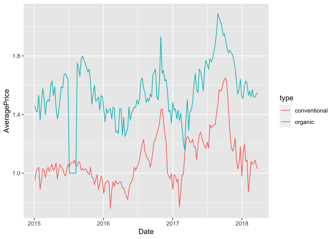
If we feel good on time, we can make a few adjustments to the plot before animating it.
ggplot(data = avocado_us,
       mapping = aes(x = Date, y = AveragePrice, color = type)) +
  geom_line() +
  scale_y_continuous(labels = scales::dollar_format()) +  # format that y axis!
  scale_color_manual(values= c("darkgreen", "darkolivegreen3")) +
  theme_minimal() +
  labs(title = "Average Price of US Avocados",
       caption = "Source: Kaggle")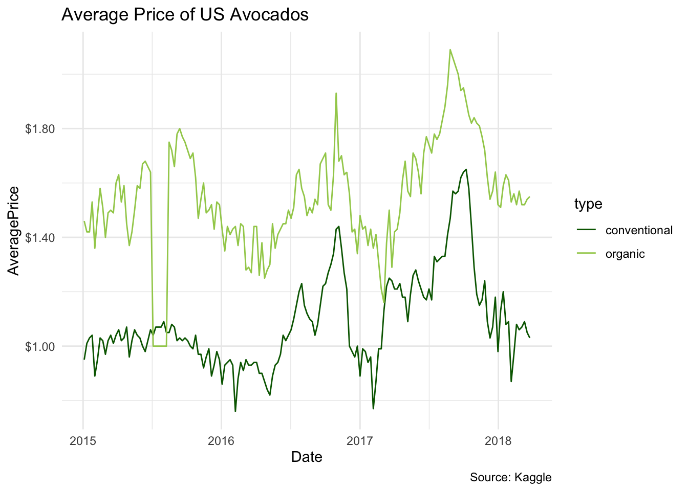
This looks a lot better. I one what happened the summer of 2015! Now let’s animate this. The key to this animation is transition_reveal(). Inside of the function, we can write out x axis variable. While it will take a few moments to render, you should see an animated plot in your plots pane.
ggplot(data = avocado_us,
       mapping = aes(x = Date, y = AveragePrice, color = type)) +
  geom_line() +
  scale_y_continuous(labels = scales::dollar_format()) +  # format that y axis!
  scale_color_manual(values= c("darkgreen", "darkolivegreen3")) +
  theme_minimal() +
  labs(title = "Average Price of US Avocados",
       caption = "Source: Kaggle") +
  transition_reveal(Date)
Let’s also save this, since each time we run the code it takes some time.
anim_save(filename = "type_reveal.gif")
Challenge
Take a few minutes to try and plot the changes in total volume of organic avocados across time for the different regions of the USA.
transition_time()
Transition time creates new “layers” of the animation over a continous variable, usually time (i’ve never seen an exception to that). While this works best with geom_point, there’s many other options you can play around with.
Let’s use two continous variables to plot this. Let’s see how well price explains the volume sold of avocados for non-organic avocados (though, it’s been awhile since I took Econ101). Let’s do this for the different cities in the US, omitting states and regions.
avocado_cities_filtered <- avocado_cities %>%
  filter(type == "conventional",
         Date > as.Date("2018-01-01"))
ggplot(data = avocado_cities_filtered,
       mapping = aes(x = AveragePrice, y = `Total Volume`, color = region)) +
  geom_point()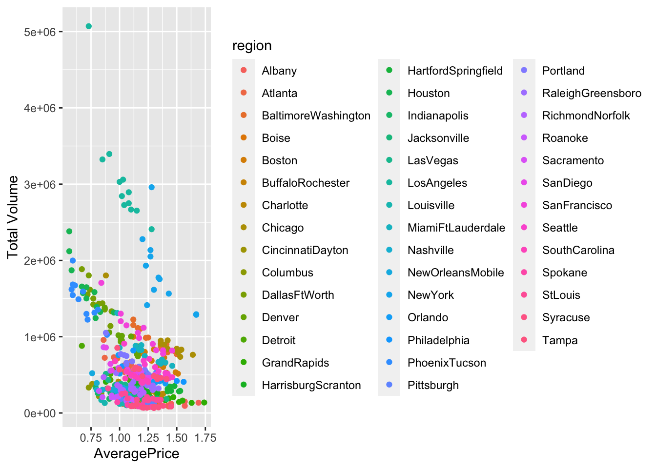
That legend is really going to get in the way. Let’s remove it and customize the circles before animating.
ggplot(data = avocado_cities_filtered,
       mapping = aes(x = AveragePrice, y = `Total Volume`, color = region)) +
  scale_y_continuous(labels = scales::comma_format()) +
  scale_x_continuous(labels = scales::dollar_format()) +
  geom_point(aes(size = `Total Volume`), alpha = .6) +
  theme_minimal() +
  theme(legend.position = "none") +
labs(title = "Avocados sold by price and city") 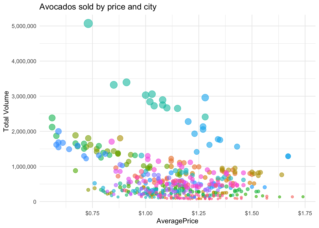
In practice, the animation is basically layering a bunch of plots on top of each other, as if they were facet_wraps. When I’m planning out an animation, I often use facet_wrap like you learned this morning to see the different layers before I “assemble” them.
ggplot(data = avocado_cities_filtered,
       mapping = aes(x = AveragePrice, y = `Total Volume`, color = region)) +
  scale_y_continuous(labels = scales::comma_format()) +
  scale_x_continuous(labels = scales::dollar_format()) +
  geom_point(aes(size = `Total Volume`), alpha = .6) +
  theme_minimal() +
  theme(legend.position = "none") +
  labs(title = "Avocados sold by price and city") +
  facet_wrap(~Date)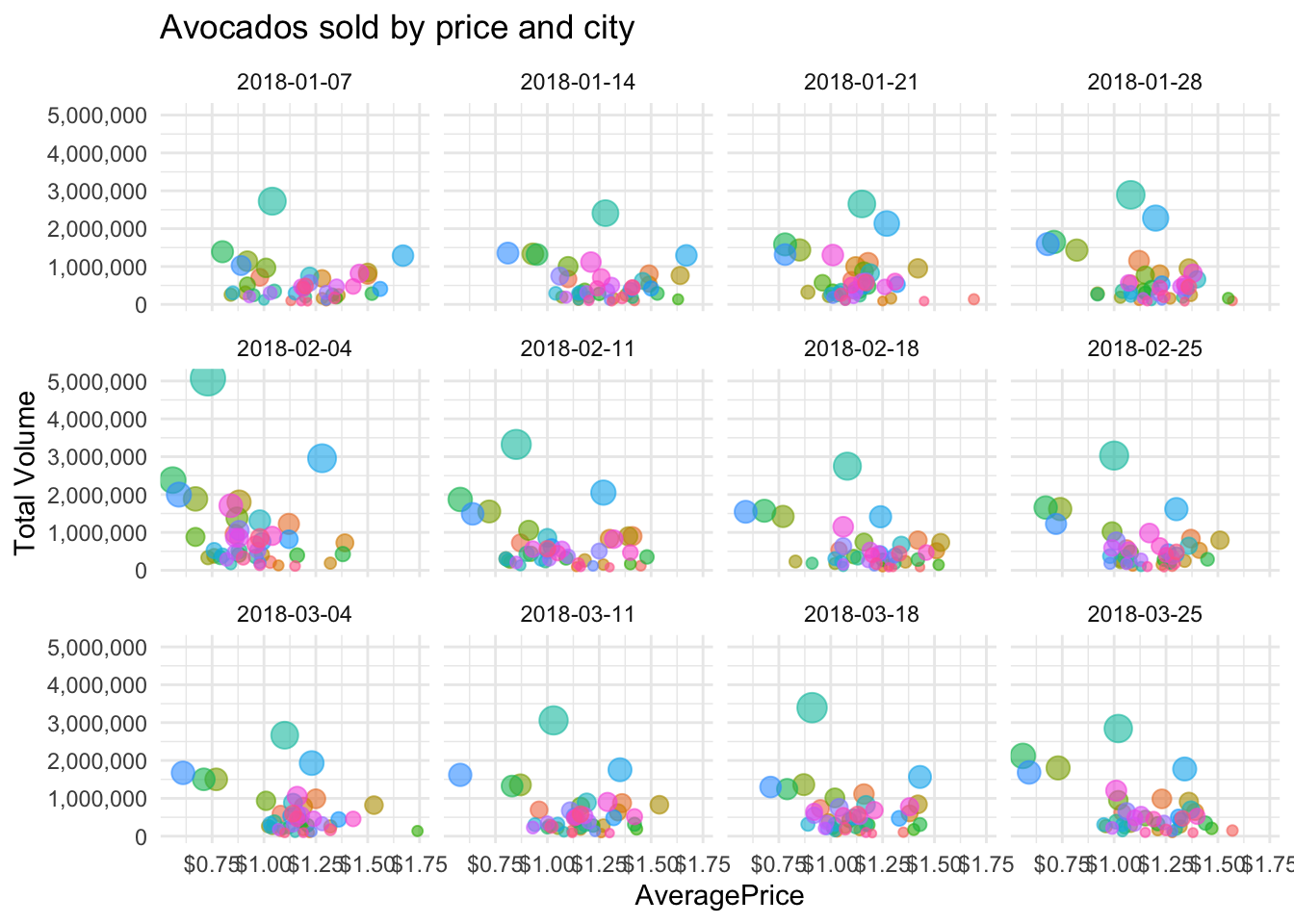
Now we can move on to animating this. transition_time() will replace the previous dot, making it hard to see any trends. Let’s add shadow_wake so we can see the direction between points.
One really cool trick I like to employ is writing in the subtitle what point in time we’re currently animating. Before it didn’t really matter because the date was on the x axis, but not its hidden. For that, we need to add some {} in the subtitle argument of labs.
ggplot(data = avocado_cities_filtered,
       mapping = aes(x = AveragePrice, y = `Total Volume`, color = region)) +
  scale_y_continuous(labels = scales::comma_format()) +
  scale_x_continuous(labels = scales::dollar_format()) +
  geom_point(aes(size = `Total Volume`), alpha = .6) +
  theme_minimal() +
  theme(legend.position = "none") +
  labs(title = "Avocados sold by price and city",
       subtitle = "Date: {frame_time}") +
  transition_time(Date) +
  shadow_wake(wake_length = 0.2)
Let’s also save this, since each time we run the code it takes some time.
anim_save(filename = "type_time.gif")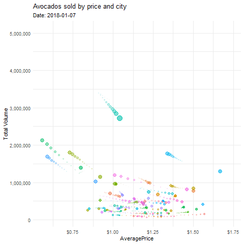
Challenge
Can you use transition_time to show how the price of organic avocados change over time for California?
transition_state()
Transition_state() creates a new animation layer across a categorical variable instead of over time.
avocado_region_long <- avocado_region %>%
  pivot_longer(cols = c(`4046`,`4225`,`4770`),
               names_to = "size",
               values_to = "volume")
ggplot(data = avocado_region_long,
       mapping = aes(x = size, y = volume, color = size)) +
geom_boxplot() 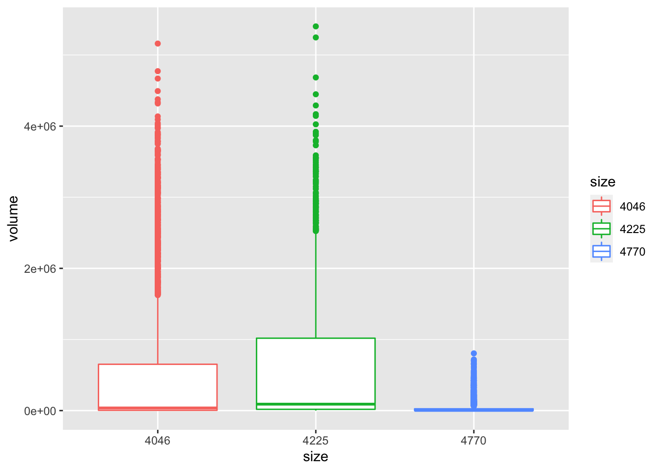
Let’s customize this a little to make it look nicer.
ggplot(data = avocado_region_long,
       mapping = aes(x = size, y = volume, color = size)) +
  geom_boxplot() +
  theme_classic() +
  scale_y_continuous(labels = scales::comma_format()) +
  labs(title = "Boxplot of volume sold by Avocado Size")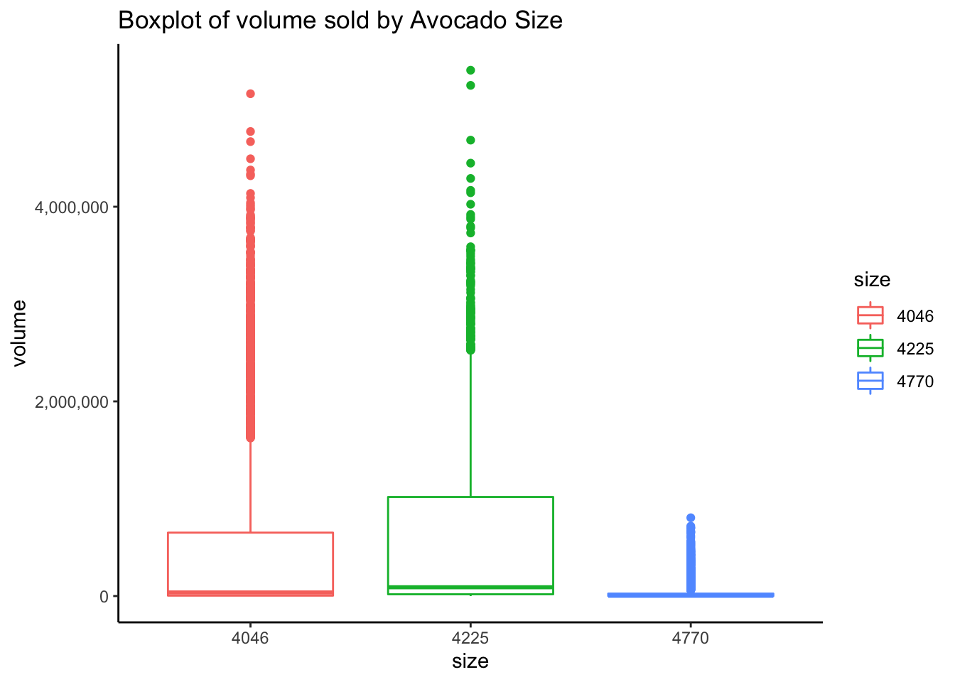
It isn’t particularly helpful that the previous view completely dissappears as in transition_time. Instead of using shadow_wake(), let’s use shadow_mark() to the animated plot to keep the past views visible.
ggplot(data = avocado_region_long,
       mapping = aes(x = size, y = volume, color = size)) +
  geom_boxplot() +
  theme_classic() +
  scale_y_continuous(labels = scales::comma_format()) +
  labs(title = "Boxplot of volume sold by Avocado Size") +
  transition_states(size, state_length = 1, transition_length = 1) +
  shadow_mark(alpha = 0.3, size = 0.5)
Let’s also save this, since each time we run the code it takes some time.
anim_save(filename = "type_state.gif")
Challenge answers:
Challenge 1: Take a few minutes to try and plot the changes in total volume across time for the different regions of the USA.
ggplot(data = filter(avocado_region, type == "organic"),
       aes(x = Date, y = `Total Volume`, color = region)) +
  geom_line() +
  theme_minimal() +
  labs(title = "Average Price of US Avocados",
       caption = "Source: Kaggle",
       subtitle = "Date: {frame_along}") +
  transition_reveal(Date)
anim_save("challenge_1.gif")
Challenge 2: Can you use transition_time to show how the price of organic avocados change over time for California?
ggplot(data = filter(avocado_CA, type == "organic"),
       mapping = aes(x = Date, y = AveragePrice)) +
  scale_y_continuous(labels = scales::dollar_format()) +
  geom_point(alpha = .6) +
  theme_minimal() +
  theme(legend.position = "none") +
  labs(title = "The fluctuating price of organic avocados in California",
       subtitle = "Date: {frame_time}") +
  transition_time(Date) +
  shadow_wake(wake_length = 0.2)
anim_save("challenge_2.gif")
Kelsey E. Gonzalez, PhD
Associate Principal Data Scientist
Data Scientist; Computational Social Scientist.