Coronavirus Mobility
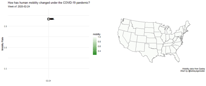
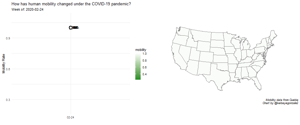
This visualization aims to understand population behavior during the COVID-19 pandemic. I use aggregated human mobility data (how far people move each day) from Cuebiq, an offline intelligence and measurement marketing company, which partners with 86 apps to collect first-party location data. Different U.S. states have handled the Covid-19 Pandemic in vastly different ways, with some states still refraining from issuing stay-at-home orders. This has led to very different mobility behaviors by state. I show that the stay-at-home order successfully reduced movement during the week of March 23rd and April 13th, with Americans reverting towards pre-COVID-19 movement patterns in between.
This visualization won the University of Arizona Library Data Visualization Contest. Learn more here: https://new.library.arizona.edu/news/2020-data-visualization-challenge-winners
- Data is available at https://www.cuebiq.com/visitation-insights-covid19/
- Source Code is available at https://github.com/kelseygonzalez/covid_mobility
- a doi for this visualization is available at https://doi.org/10.25422/azu.data.12374810.v1
Kelsey E. Gonzalez, PhD
Associate Principal Data Scientist
Data Scientist; Computational Social Scientist.