European Energy Consumption
With Tidy Tuesday 2020-08-04, I use a dataset of European energy sources to explore the similarity of country energy sources by source and size.
load packages
if (!require("pacman")) install.packages("pacman")## Loading required package: pacmanpacman::p_load(tidytuesdayR, factoextra, ggdendro, dendextend, tidyverse, patchwork)load and wrangle data
tuesdata <- tidytuesdayR::tt_load(2020, week = 32)## --- Compiling #TidyTuesday Information for 2020-08-04 ----## --- There are 2 files available ---## --- Starting Download ---##
## Downloading file 1 of 2: `energy_types.csv`
## Downloading file 2 of 2: `country_totals.csv`## --- Download complete ---totals <- tuesdata$energy_types %>%
filter(country != "EL",
!is.na(country_name),
level != "Level 2") %>%
select(country_name, type, `2016`) %>%
pivot_wider(id_cols = country_name, names_from = type, values_from = `2016`) %>%
rowwise() %>%
mutate(total = rowSums(across(`Conventional thermal`:Other)),
across(`Conventional thermal`:Other, ~ . / total))
props <- totals %>%
select(-total) %>%
column_to_rownames("country_name") %>%
as.matrix() %>%
scale()
totals <- totals %>%
select(name = country_name, total)Perform hierarchical clustering
hc1 <- hclust(dist(props), method = "ward.D2" )
sub_grp <- cutree(hc1, k = 5)
Render plot A:
plota <- hc1 %>%
as.dendrogram %>%
set("branches_k_color",
value = c("#43aa8b", "#577590","#f3722c","#f94144","#90be6d"),
k = 5) %>%
set("labels_col",
value = c("#43aa8b", "#577590","#f3722c","#f94144","#90be6d"),
k = 5) %>%
set("labels_cex", 0.5) %>%
set("branches_lwd", 0.5) %>%
as.ggdend() %>%
ggplot(horiz = TRUE) +
theme(axis.text.y = element_text(size=1)) +
theme_minimal(base_family = "Roboto Condensed", base_size = 14) +
theme(axis.text = element_blank(),
axis.title = element_blank(),
panel.grid = element_blank(),
panel.border = element_blank(),
legend.position = "none")
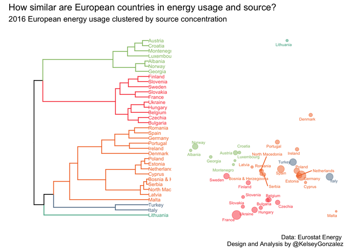
plota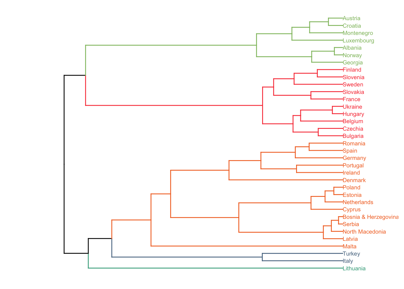
Render plot B:
clusters <- fviz_cluster(list(data = props, cluster = sub_grp), repel = TRUE,
                         outlier.color = "black", ggtheme = theme_minimal())

plotb <- clusters$data %>%
  left_join(totals) %>%
  ggplot(aes(x, y, color = cluster)) +
  geom_point(aes(size = total), alpha = 0.5) +
  ggrepel::geom_text_repel(aes(label = name), size = 2) +
  scale_color_manual(values = c("#f94144", "#f3722c", "#90be6d", "#577590", "#43aa8b")) +
  theme_minimal() +
  theme(axis.text = element_blank(),
        axis.title = element_blank(),
        panel.grid = element_blank(),
        panel.border = element_blank(),
        legend.position = "none")
## Joining, by = "name"plotb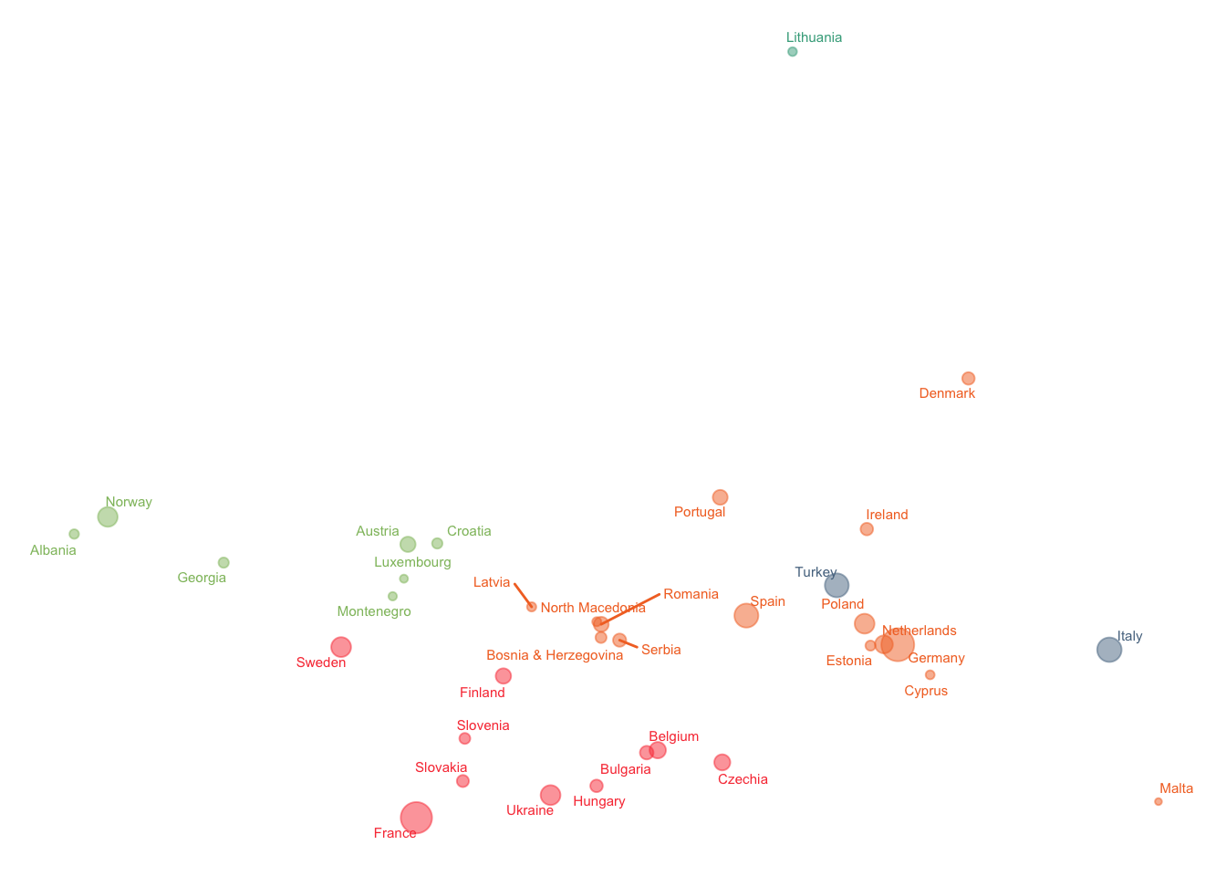
Combine plots A & B with patchwork:
plota + plotb + plot_annotation(
  title = 'How similar are European countries in energy usage and source?',
  subtitle = '2016 European energy usage clustered by source concentration',
  caption = 'Data: Eurostat Energy \n Design and Analysis by @KelseyGonzalez') +
  theme_minimal(base_family = "Roboto Condensed", base_size = 14) +
  theme(axis.text = element_blank(),
        axis.title = element_blank(),
        panel.grid = element_blank(),
        panel.border = element_blank(),
        legend.position = "none")
# save plot
ggsave("2020-08-04.png")
## Saving 7 x 5 in imageKelsey E. Gonzalez, PhD
Associate Principal Data Scientist
Data Scientist; Computational Social Scientist.