Rankings of Sociological Programs

Data visualization is an iterative process, which for me, lasted several months of improving my R wrangling skills and ggplot2 visualization techniques. In this post, I will walk you through my process of going from a pretty rudimentary plot, to a visualization that portrays the original idea.
side note: I wanted to look at these data out of personal interest. Department rankings are not based on learning quality or training ability of the respective departments. That being said, as with every institutional ranking system, this “arbitrary” designation has real impacts on student job placement, funding, and other real-world consequences.
First, lets load our data. About 6 months ago I really wanted to look at the historical US News rankings of different Sociology graduate programs in the United States. While university rankings are notoriously elitist and are only one component of obtaining a tenure-track position, my innate desire to visualize overcame me. Using the wayback machine, I mined the rankings from 2005 to 2017. We’ll see if there are 2020 rankings released, given the circumstances.
Here are the datasources for the various years: 2017, 2013, 2009, 2005.
#load packages
if(!require(pacman)){install.packages("pacman")}
pacman::p_load(tidyverse, ggbump, ggrepel, hrbrthemes, plotly)
#load the data
rankings_long <- read_csv("sociology_rankings.csv") %>%
select(-rank20) %>%
filter(rank05 != 100) %>%
mutate(change = rank17 - rank05,
direction = case_when(change > 2 ~ "Fallen",
change < -2 ~ "Risen",
TRUE ~ "Stable")) %>%
pivot_longer(cols = rank17:rank05,
names_prefix = "rank", names_to = "year",
values_to = "rank") %>%
mutate(year = as.numeric(year),
year = ifelse(year > 10, paste0("20", year), paste0("200", year)),
year = as.numeric(year))
rankings_long_2020 <- read_csv("sociology_rankings.csv") %>%
filter(rank05 != 100) %>%
mutate(change = rank20 - rank05,
direction = case_when(change > 2 ~ "Fallen",
change < -2 ~ "Risen",
TRUE ~ "Stable")) %>%
pivot_longer(cols = rank20:rank05,
names_prefix = "rank", names_to = "year",
values_to = "rank") %>%
mutate(year = as.numeric(year),
year = ifelse(year > 10, paste0("20", year), paste0("200", year)),
year = as.numeric(year))January 7, 2020
rankings_long %>%
ggplot(aes(x=year, y=rank, group=school_short)) +
geom_line(aes(color = school_short),
size = 1,
position=position_dodge(width=0.2),
show.legend = FALSE) +
scale_y_reverse(breaks=seq(1,90,5)) +
geom_text_repel(data = filter(rankings_long, year == "2017"), aes(label = school_short),
nudge_x = 1,
na.rm = TRUE,
size = 2) +
ggtitle("US News Sociology Rankings Over The Years") +
xlab("Year") +
ylab("Ranking") +
facet_wrap(~direction) +
theme_minimal() Issues with this attempt:
- Doesn’t five you an idea of actual amount risen or fallen as the plots are separated
- Separating the plots like this is messy
- overplotting of labels and lines
- ugly x-axis
January 30, 2020
df.p2 <- rankings_long %>%
mutate(direction = cut(change,
c(-20,-5, -2, 2, 5, 20),
labels=c("palegreen4", "palegreen2", "seashell3","red1", "red4"))) %>%
mutate(label05 = ifelse(year == 2005, school_short, ""),
label17 = ifelse(year == 2017, school_short, "")) %>%
select(-change) %>%
mutate(flag = ifelse(school_short %in% c("Notre Dame","NYU", "Harvard",
"Princeton", "Minnesota", "Virginia",
"Wisconsin", "John Hopkins",
"Arizona", "UIUC"), TRUE, FALSE),
school_col = if_else(flag == TRUE, school_short, "zzz"))
ggplot(data = df.p2, aes(x = year, y = rank, group = school_short)) +
geom_line(aes(color = school_col, alpha = 1), size = 2) +
geom_point(aes(color = school_col, alpha = 1), size = 4) +
geom_point(color = "#FFFFFF", size = 1) +
scale_y_reverse(breaks = seq(1,40, 5), limits = c(40,1)) +
geom_text(aes(label = label05, x = 2004.8) , hjust = .95, fontface = "bold", color = "#888888", size = 2) +
geom_text(aes(label = label17, x = 2017.2) , hjust = 0.05, fontface = "bold", color = "#888888", size = 2) +
# coord_cartesian(ylim = c(1,40)) +
theme_minimal() +
theme(legend.position = "none") +
labs(x = "",
y = "Rank",
title = "US News Sociology Rankings") +
scale_color_manual(values = c("darkred",# "Arizona"
"forestgreen",# "Harvard",
"darkred", # "John Hopkins",
"forestgreen", # "Minnesota",
"forestgreen", #Notre Dame
"forestgreen", # "NYU",
"forestgreen", # "Princeton",
"darkred", #UIUC
"forestgreen", #virginia
"darkred",# "Wisconsin",
"grey")) Issues with this attempt:
- While not separated out, overplotting of the same-rank programs is an issue
- The overplotting intermixes the colors and makes it all meaningless
- red green dichotomies are bad for accessibility
March 23, 2020
highest_rise <- rankings_long %>%
filter(year == "2017") %>%
arrange(change) %>%
head(7) %>%
pull(school_short)
highest_drop <- rankings_long %>%
filter(year == "2017") %>%
arrange(desc(change)) %>%
head(11) %>%
pull(school_short)
df.p3 <- rankings_long %>%
mutate(colors = case_when(school_short %in% highest_rise ~ "deeppink3",
school_short %in% highest_drop ~ "navyblue",
TRUE ~ "grey80"),
alpha = case_when(school_short %in% highest_rise ~ 1,
school_short %in% highest_drop ~ 1,
TRUE ~ .75))
col <- as.character(df.p3$colors)
names(col) <- as.character(df.p3$colors)
ggplot() +
geom_line(data = rankings_long %>% filter((! school_short %in% highest_rise) & (! school_short %in% highest_drop)),
aes(x = year, y = rank, group = school_short),
size = 1, color = "grey80") +
geom_line(data = rankings_long %>% filter(school_short %in% highest_rise),
aes(x = year, y = rank, group = school_short),
size = 1, color = "deeppink3") +
geom_line(data = rankings_long %>% filter(school_short %in% highest_drop),
aes(x = year, y = rank, group = school_short),
size = 1, color = "navyblue") +
geom_text(data = rankings_long %>% filter((! school_short %in% highest_rise) & (! school_short %in% highest_drop) & (year == 2017)),
aes(x = 2017, y = rank, label = school_short),
hjust = 0,
fontface = "bold", color = "grey80", size = 2) +
geom_text(data = rankings_long %>% filter((school_short %in% highest_rise) & (year == "2017")),
aes(x = 2017, y = rank, label = paste(rank, school_short)),
hjust = 0, check_overlap = TRUE,
fontface = "bold", color = "deeppink3", size = 2) +
geom_text(data = rankings_long %>% filter((school_short %in% highest_rise) & (year == "2005")),
aes(x = 2005, y = rank, label = paste(rank, school_short)),
hjust = 1, check_overlap = TRUE,
fontface = "bold", color = "deeppink3", size = 2) +
geom_text(data = rankings_long %>% filter((school_short %in% highest_drop) & (year == "2017")),
aes(x = 2017, y = rank, label = paste(rank, school_short)),
hjust = 0, check_overlap = TRUE,
fontface = "bold", color = "navyblue", size = 2) +
geom_text(data = rankings_long %>% filter((school_short %in% highest_drop) & (year == "2005")),
aes(x = 2005, y = rank, label = paste(rank, school_short)),
hjust = 1, check_overlap = TRUE,
fontface = "bold", color = "navyblue", size = 2) +
labs(title = "While quite stable, some Sociology programs rise and fall in the rankings",
subtitle = "Sociology ranking over the years.",
caption = paste(c("Source: US News and World Report",
"github.com/kelseygonzalez"),
collapse = "\n")
) +
scale_y_reverse() +
scale_x_discrete(expand = c(.05, .05)) +
theme(
plot.background = element_rect(fill = "white"),
panel.background = element_rect(fill = "white"),
panel.grid.major.y = element_blank(),
panel.grid.minor.y = element_blank(),
legend.position = "none",
axis.text.y = element_blank(),
axis.text.x = element_text(size = 8),
axis.title = element_blank(),
axis.ticks = element_blank(),
plot.subtitle=element_text(size=10, color="grey60", face="italic"),
plot.caption=element_text(size=8, color="grey60")
) Issues with this attempt:
- At least its all on the same graph & shows rising and falling programs
- Overplotting makes a a lot of ranks impossible to read
- fixes accessibility issues
May 8, 2020
# extract jumps over 5 spots
highest_rise <- rankings_long %>%
filter(year == "2017",
change <= -5) %>%
arrange(change) %>% head(10) %>%
pull(school_short)
# extract drops over 5 spots
highest_drop <- rankings_long %>%
filter(year == "2017",
change >= 5) %>%
arrange(desc(change)) %>%
pull(school_short)
rank <- rankings_long %>%
select(school, school_short, rank, year) %>%
group_by(year) %>%
# clean up rankings with rank() function
mutate(rank_untied = rank(rank, ties.method = "first")) %>%
ungroup() %>%
mutate(interesting = case_when(school_short %in% highest_drop ~ "drop",
school_short %in% highest_rise ~ "jump",
TRUE ~ "normal"),
school_short = str_trim(school_short, side = "both"))
ggplot(rank,
aes(x = year, y = rank_untied, group = school_short, color = interesting)) +
geom_point(size = 3.5) +
geom_text(data = rank %>% filter(year == min(year)),
aes(x = year - 0.25, label = school_short), size = 2, hjust = 1, face = "bold") +
geom_text(data = rank %>% filter(year == max(year)),
aes(x = year + 0.25, label = school_short), size = 2, hjust = 0, face = "bold") +
geom_bump(size = 2, smooth = 8, alpha =.8) +
geom_text(aes(x = year, y = rank_untied, label = rank), color = "white", size = 2) +
scale_y_reverse(expand = c(0,.5)) +
coord_cartesian(ylim = c(30, 0)) +
scale_x_continuous(breaks = seq(2005, 2017, 4), expand = c(0,1.5), position = "top")+
scale_color_manual(values = c("#B85854","#799CB8", "#b5b867"))+
hrbrthemes::theme_ipsum_rc() +
theme(legend.position = "none",
panel.grid.major = element_blank(),
panel.grid.minor = element_blank(),
axis.text.x = element_text(size = 10, color = "#153354", face = "bold"),
axis.title.y = element_blank(),
axis.title.x = element_blank(),
axis.text.y = element_blank(),
plot.title = element_text(color = "#153354",face = "bold", size = 18, vjust = 0),
plot.subtitle = element_text(color = "#153354",face = "plain", size = 12, vjust = 1),
plot.caption = element_text(color = "#153354"),
plot.margin = margin(0,0,0,0, "cm")) +
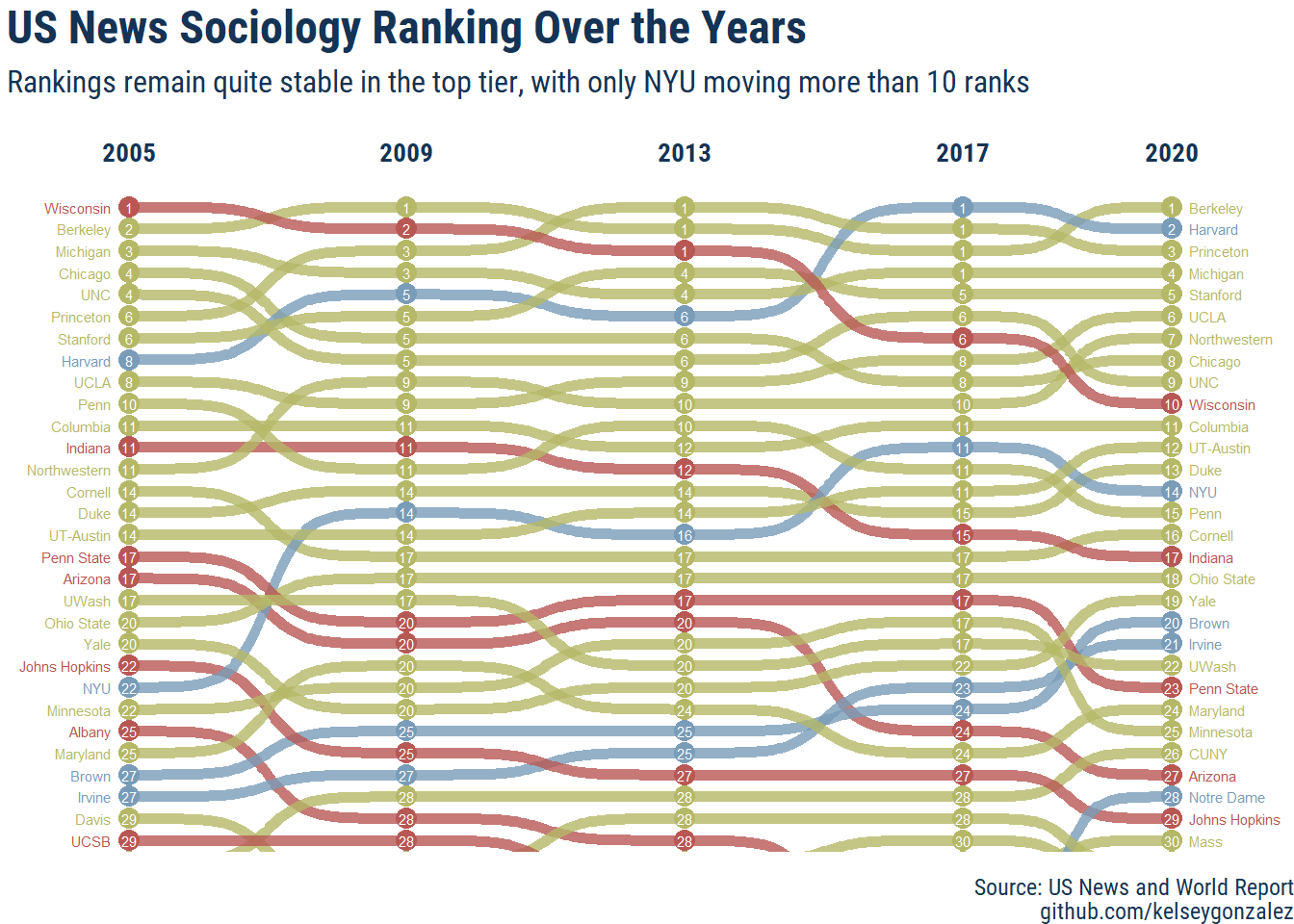
labs(title = "US News Sociology Ranking Over the Years",
subtitle = "Rankings remain quite stable in the top tier, with only NYU moving more than 10 ranks",
caption = paste(c("Source: US News and World Report",
"github.com/kelseygonzalez"),
collapse = "\n")) 
When I discovered ggbump, I knew this would fix all of my issues! Also, this required
the employment of rank(rank, ties.method = "first") to solve the same rank overplotting
issues in a “fair” way.
I chose to plot just the top 30 programs to keep it simple, but also plotted the top 50 below:
top_60 <- ggplot(rank,
aes(x = year, y = rank_untied, group = school_short, color = interesting,
label2 = school, label3 = rank)) +
geom_text(data = rank %>% filter(year == min(year)),
aes(x = year - 0.25, label = school_short), size = 2, hjust = 1, face = "bold") +
geom_text(data = rank %>% filter(year == max(year)),
aes(x = year + 0.25, label = school_short), size = 2, hjust = 0, face = "bold") +
geom_bump(size = 2, smooth = 8, alpha =.8) +
geom_point(size = 3.5) +
geom_text(aes(x = year, y = rank_untied, label = rank), color = "white", size = 2) +
scale_y_reverse(expand = c(0,.5)) +
coord_cartesian(ylim = c(60, 0)) +
scale_x_continuous(breaks = seq(2005, 2017, 4), expand = c(0,1.5), position = "top") +
scale_color_manual(values = c("#B85854", "#799CB8", "#b5b867"))+
hrbrthemes::theme_ipsum_rc() +
theme(legend.position = "none",
panel.grid.major = element_blank(),
panel.grid.minor = element_blank(),
axis.text.x = element_text(size = 10, color = "#153354", face = "bold"),
axis.title.y = element_blank(),
axis.title.x = element_blank(),
axis.text.y = element_blank(),
plot.title = element_text(color = "#153354",face = "bold", size = 16, vjust = 0),
plot.subtitle = element_text(color = "#153354",face = "plain", size = 10, vjust = 1),
plot.caption = element_text(color = "#153354"),
plot.margin = margin(1,1,1,1, "cm")) +
labs(title = "Top 50 US News Sociology Ranking Over the Years",
subtitle = "Rankings remain quite stable in the top tier, much more variation in other tiers",
caption = paste(c("Source: US News and World Report",
"github.com/kelseygonzalez"),
collapse = "\n"))
top_60
August 16, 2020
And, since I’m finally turning this into a blogpost, how about we make this interactive for fun?
top_60_plotly <- top_60 +
# scale_x_continuous(breaks = seq(2005, 2017, 4), limits = c(2004, 2018), position = "top") +
theme(plot.margin = margin(3,1,1,1, "cm"))
plotly::ggplotly(top_60_plotly, tooltip = c("school", "year", "rank"))I’m not sure why the labels are getting so cut off, but that’s a bug for another day.
Update: Octover 7th, 2021
Now that the 2020 rankings have been published by US News, here’s an update to the plot:
# extract jumps over 5 spots
highest_rise <- rankings_long_2020 %>%
filter(year == "2020",
change <= -6) %>%
arrange(change) %>% head(10) %>%
pull(school_short)
# extract drops over 5 spots
highest_drop <- rankings_long_2020 %>%
filter(year == "2020",
change >= 6) %>%
arrange(desc(change)) %>%
pull(school_short)
rank <- rankings_long_2020 %>%
select(school, school_short, rank, year) %>%
group_by(year) %>%
# clean up rankings with rank() function
mutate(rank_untied = rank(rank, ties.method = "first")) %>%
ungroup() %>%
mutate(interesting = case_when(school_short %in% highest_drop ~ "drop",
school_short %in% highest_rise ~ "jump",
TRUE ~ "normal"),
school_short = str_trim(school_short, side = "both"))
ggplot(rank,
aes(x = year, y = rank_untied, group = school_short, color = interesting)) +
geom_point(size = 3.5) +
geom_text(data = rank %>% filter(year == min(year)),
aes(x = year - 0.25, label = school_short), size = 2, hjust = 1, face = "bold") +
geom_text(data = rank %>% filter(year == max(year)),
aes(x = year + 0.25, label = school_short), size = 2, hjust = 0, face = "bold") +
geom_bump(size = 2, smooth = 8, alpha =.8) +
geom_text(aes(x = year, y = rank_untied, label = rank), color = "white", size = 2) +
scale_y_reverse(expand = c(0,.5)) +
coord_cartesian(ylim = c(30, 0)) +
scale_x_continuous(breaks = c(2005, 2009, 2013, 2017,2020), expand = c(0,1.5), position = "top")+
scale_color_manual(values = c("#B85854","#799CB8", "#b5b867"))+
hrbrthemes::theme_ipsum_rc() +
theme(legend.position = "none",
panel.grid.major = element_blank(),
panel.grid.minor = element_blank(),
axis.text.x = element_text(size = 10, color = "#153354", face = "bold"),
axis.title.y = element_blank(),
axis.title.x = element_blank(),
axis.text.y = element_blank(),
plot.title = element_text(color = "#153354",face = "bold", size = 18, vjust = 0),
plot.subtitle = element_text(color = "#153354",face = "plain", size = 12, vjust = 1),
plot.caption = element_text(color = "#153354"),
plot.margin = margin(0,0,0,0, "cm")) +
labs(title = "US News Sociology Ranking Over the Years",
subtitle = "Rankings remain quite stable in the top tier, with only NYU moving more than 10 ranks",
caption = paste(c("Source: US News and World Report",
"github.com/kelseygonzalez"),
collapse = "\n"))